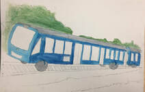
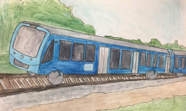
 1. I used 2 point perspective for this piece.
2. The photo used for this watercolor perspective piece is of a vibrant blue train passing by on train tracks. It was taken around St. Charles, Illinois. It was taken during the day to show how nice and vibrantly colored the train looks from a more interesting perspective, showing trees and grass behind it. 3. I found initially drawing it in the right perspective before adding watercolor to be difficult. I had to erase often and redraw parts of it so that everything would line up correctly, matching the perspective. Making the train appear to be coming from the distance, the train tracks, and the flat front of the train all look like they fit the perspective was hard to do, and I needed to look at my reference picture and visualize it before sketching. 4. The copying an illustration from a child's book warm up helped me as I has never previously used watercolor, so it helped me learn the correct amounts of water to use and figure out how to make and lighten colors with watercolor. The 3D letters warm up helped me with perspective. Along with learning how to make the different types of perspective from this warm up, knowing how to draw in 2 point perspective helped make it easier to do my watercolor perspective piece when drawing the train.
0 Comments
1. I found the illustration from a child's book the most helpful and interesting activity. Trying to copy a watercolor illustration while never having used water color before allowed me to learn and figure out what the best techniques to use are. This includes how much water to use and creating colors to match the illustration in the book. It was also interesting to see the different ways illustrators can use watercolor.
2. I like how quick and easy watercolor is to use after you learn how to use it. Setting it up is usually quick as well as using it to color a drawing. I also like how you do not need to wait as long for it to dry like you do with painting. I think watercolor is also good for making simple designs and illustrations as it has an overall simple look to it and blends together nicely. 3. For me, using the correct amount of water in watercolor is difficult. This is due to problems that occur when I use to much water color, which along with brushing too hard can cause clumps of the watercolor paper to appear, and when I use too little water, the watercolor doesn't spread and looks too dark in an area.
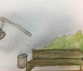
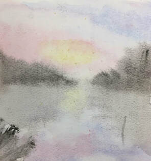
*Most helpful is the 3 ways of mixing brown. 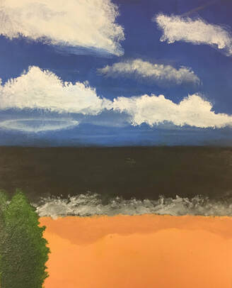 1. The place represented in my art is the beach, from a view of one would have when looking down towards it. The beach is important to me as it is the only vacation place my family consistently goes to each summer, sometimes with my cousins from another state. This makes it a place I remember for gathering and spending time with my family. Since we go during the summer, it is also a calm place to be for me as there is nothing to stress about, rather it is fun and enjoyable. 2. The most challenging part of my picture was getting the depth and texture of the water in the ocean to look more realistic and water-like, instead of being perfectly still. The addition of the right amount of light reflecting in the water was difficult to get correct. 3. I believe that the most successful part of my piece is the sky and clouds. The color blue that I was able to create for the sky looks realistic and very similar to my reference image. I slowly made the clouds with my brush and added white around them which resulted in a realistic look. The various greens in the bush where it is lighter towards the top where the sunlight would hit also contributed to the success as a whole as it helped bring in sunlight to the painting. 4. The process of painting this image started with finding a good reference image to base my painting off of, and priming the paper. After mixing the appropriate colors to match the reference image that I chose, I started by adding a sky section, an ocean section, and a shore section to my painting and waited for it to dry. Then I added another layer of darker blue to certain parts of the sky, and clouds. Next was the ocean, then the sand, and after that dried, adding white to the ocean where it splashes on the shore. I then added the bush with various types of green in the corner and fixed minor details in the painting to finish. * I will have a watercolor painting in progress
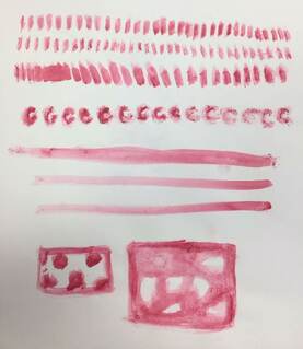
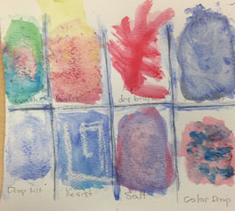
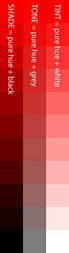
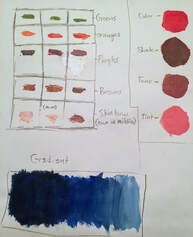
1. These activities taught me a lot about how to properly mix colors to create secondary or tertiary colors in a painting. I learned the amounts of black needed to create shade, white needed to create a tint, and that the addition of gray to another color creates a tone. Textures were another thing I learned, specifically how to make rock which I never knew how create with to with paint before.
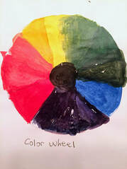
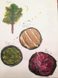
2. I believe that the tree and creating shades of brown will be the most helpful for the painting I have planned. This is because I will likely add a tree somewhere in the painting and now know the technique as to how to do it, and I will need light brown for sand and possibly other features in my painting. 3. I learned the most from creating the textures. Before learning the textures I did not know how to create fabric, fur, or rock textures which is something that I will need for this painting and future paintings. Now that I know the techniques and process of painting these textures, I will be able to replicate it and apply it to textures in my actual paintings. 4. You can make brown by combining colors opposite each other on the color wheel, complimentary colors. This could be by combining red and blue (to make purple) with yellow. Also by mixing red and green, or blue and orange. You could make it lighter with white. 5. To tone down a color, you can whitewash it by adding white paint with clear glaze, or with the addition neutral accents like adding gray to the paint.  Charcoal  Charcoal in progress 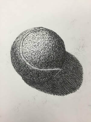 Pen 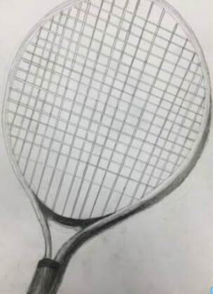 Pencil 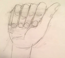 Most Helpful Warm Up For me, the most helpful warm up was the Sign Language A sketch. Prior to this warm up, I would avoid drawing hands, at least up to this detail, as I thought that I was not good at drawing them and that they would ruin my art if I drew them wrong. However, after completing this warm up, I realized hands are not that hard to make when you have a reference to draw from. This warm up also helped remind me to try to add detail in my art to make it more realistic. Definitions: Composition: The arrangement or placement of visual elements in a work of art. It is an organization of the elements of art according to the principals of art. It can add tension, proportion, balance, and interest in a piece of art. Value: The design element that defines the light and dark in artwork. It can be used to create light and shadows. Pen
Pros: Lines appear more clean than other mediums. The drawing is darker and smoother. It is good for calligraphy and making a drawing bold as well. Cons: You cannot erase, meaning you need to be more careful about mistakes while drawing. Shading is not as easy as other mediums since you have to use ways like hatching and stippling. Charcoal Pros: Blending and softening is easy and looks good. If you make a mistake you can simply add more charcoal to fix the mistake. Cons: Messy to work with as it can smear too often on the paper or get to your skin while working. The materials are more expensive than other mediums. Pencil Pros: Shading is much easier and looks the best in this medium. You choose the pencil with the graphite darkness you need. You can erase as well. Cons: It can be smudged easily. You have to regularly sharpen your pencil .
Frank Gonzales (Website link) - https://frankgonzales.net/home.htm
|