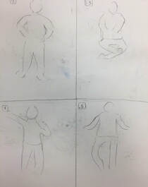
Section 1Required Questions 1. There are different parts to the art criticism process. The first part of the art criticism process is to describe the artwork. Here you list what you see in the artwork, including the images you see, art elements, and color schemes. For instance, if you were to describe the art piece to someone over the phone. Next is to analyze the artwork. To do this you list the art elements and color principles, such as color, value, line, shape, form, texture, space, balance, harmony, emphasis, proportion, movement, rhythm, and variety. Now you interpret the artwork. This means to determine the mood and feelings that are communicated, as well as the story told and ideas represented by the piece. Finally you judge the artwork. To judge the artwork you put what you think of the artwork, your thoughts in general and why you think the pieceis successful, or why you don’t. You should support your opinion with criteria or evidence, such as art skills, the meaning, creative and realistic.
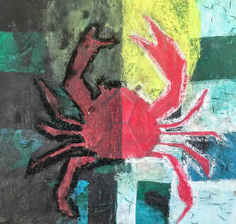
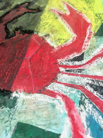
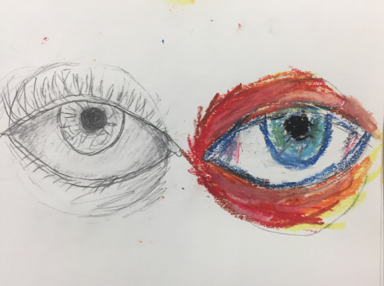
background, yellow, and red of different shades, with more vibrant, brighter colors on the right side and darker, more dull versions of the same color on the left. Although there is not one color scheme, the foreground and uppermost layers are warm colors and the background has cool colors. Other than color, some art elements seen in this piece are value, line, space, shape and form. There is a focus of light and dark value in this piece that create a large contrast on each side. The left side contains all dark themed colors and light on the left. Due to the way these are balanced, there does appear to be an emphasis on the right side. There are thin diagonal lines on the crab to give it a more realistic pattern and texture that a normal crab would have. The checkerboard pattern was originally created using straight lines, and a thick black and white outline surrounds the crab using chalk pastel. The crab itself, however, is meant to be more geometric shaded, having straighter lines for its body, claws, and legs than round and curved like a real life crab. When I first got the idea for this piece it was to make the piece was to convey the idea of light and dark, so after drawing an outline of everything, I began adding darker shades of red to the crab on only one half and making the other lighter. I then did this with everything else in the piece, which is the reason why the checkerboard pattern isn’t all one color. This was successful in giving it the mood of there being a dark and light side to everything, or possibly sad and happy, or allowing for anyone who sees the piece to be able to tell something is contrasting, whatever it may be. I think that the overall idea and outcome was successful but think that some parts of the piece could be neater, like the chalk outline and making the checkers in the pattern neater. The shape of the crab also came out nicely but could be smoother with the prismacolor. Picked Questions
_.
skin tones, after getting the chance to experiment with paint in this class. I benefit greatly from being able to try new mediums as well. Prior to this class I would not have considered creating art using charcoal, watercolor and some other mediums we used. Now that I have, it helped me determine which mediums enjoy, which I dislike, and which mediums I will use in the future. Due to this class I can now more easily create new art projects in general after going through the process multiple times on many different projects. I developed techniques on what to focus on during a project and which parts to start out with that will make the final piece look the best. The class has prepared me for if I want to continue with art at school or on my own in the future.
pigmented, but you can also make darker or more dull things with them if you wanted to, which allows me to have both options to color any piece. The intensity of the colors are stronger than that of normal colored pencils which is one of the major reasons why I prefer prismacolor over other pencils. Another being that you can layer with them. When using them I often add white at the end to certain parts of the drawing where it should be lighter, and with prismacolor, it blends nicely and smoothly. A medium I wish I had explored is oil pastel. Oil pastel seemed interesting to me, but I did not have a piece that I wanted to use it on over a medium I liked more. I think I would like using it as it is similar to prismacolor in the sense that it is vibrant and would allow me to use layers. I have also seen some artwork made using oil pastel that I thought were great, which further make me wish I had tried it.
0 Comments
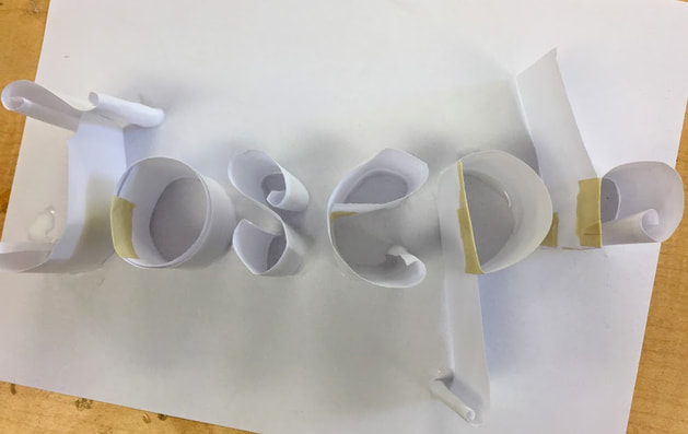 
Process:
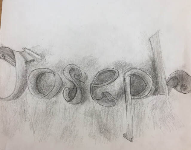
I started out by cutting out strips of paper to fold and roll into the letters. I first did the general shapes of all of the letters, starting with J. Once they were all made, I rolled the edges of parts of the letters to make a more interesting spiral look than plain letters. I then glued it onto a paper so that I could draw it. On another paper I lightly traced out the outline of the letters. Lastly, I used a pencil to draw the letters by adding shading based off of where the lights and shadows were in the lighting.
Process:
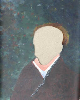
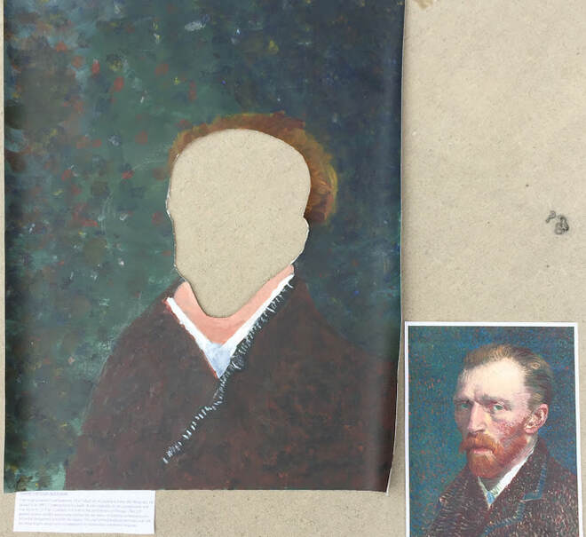
We began this piece by determining which artists piece we would try to recreate for the art show. After looking through famous paintings, Van Gogh's self portrait was decided upon. We needed the colors to match the ones in the artwork, so we started by mixing the colors until we got the proper colors. We then made the background in layers, starting with a sold green-blue color then moving on to the many dots of color that are in the original piece. After getting a similar background that looked good and accurate, we traced out where Van Gogh and his head would go so that there would be proper proportions. Next, we cut out the head shape to make it a cutout piece. We then painted the clothes using various shades of red, and white. Finally we painted on his hair using reddish blond and brown colors to match the real portrait, and let the piece dry.
For this layer, I painted a black checkerboard pattern on the left half, and white on the right half of the piece. The third medium I used was oil pastel to create a dimly lit sun on one half, and bright on the other half. For the fourth layer I used prismacolor pencils as my medium. I used them to draw a crab, then with a red and darker red combined with black, colored it. My last medium is chalk pastel, where I outlined the darker half of the crab with black and the lighter half with white.
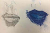
2. My word was "organized." I decided to portray this by splitting the piece into two halves, light and dark. This makes it organized as every medium in the dark half was created with the dark theme, as was the light half. To further portray organization in my piece, I centered the crab, making sure each half was mostly symmetrical. I also believe that using the checkerboard design in the background adds to this theme. 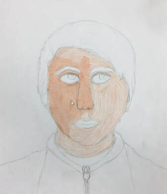  I 1. I made a portrait of myself, this also being the relationship.
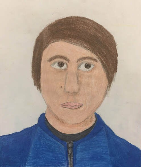
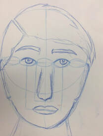
2. I used prismacolor pencils on paper to create this portrait. 3. I began by drawing a sketch with pencil, then carefully following it to use the proper proportions and sizes for the eyes, mouth, nose, and ears on the final piece. On the outline I now created, I started to use the prismacolor pencils on the face. To get a more accurate skin tone, I applied white to the original color, and tried to make it look more smooth as well. I then moved on to the jacket and shirt that I was wearing, using bright blue for its color and textured it to be more realistic, including the zipper. I colored the mouth and eyes, then the hair and eyebrows using various shades of brown. Lastly, I added shading under the chin, near the nose and on other parts of the portrait. 4. I find the colors used and texture of the jacket to be the most successful due to how accurate they are. I also believe that the proportions of the features on the face were successful. If I were to do it again, I would make the face and skin smoother where you can't see any lines or slight variations in color. I would also make the lips neater and possibly use an even darker shade of brown mixed in with the brown in the hair.
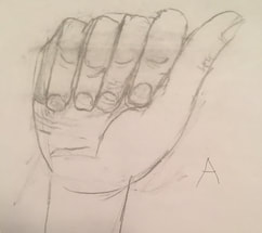
1. The warm up that is proving to be most helpful for me is the face proportions warm up. As I am drawing my portrait, I use it as something to base things off of and it helped me more easily know where to place them without having to erase or having to make multiple attempts due to a accidentally putting a feature where it doesn't match the face.
2. I found the size and placement of the eyes in the facial proportions the most surprising. This is due to the fact that I never realized how small the eyes are in proportion to other parts of the face, as well as not knowing that you could determine the placement of them on on the face by drawing five equally sized ones across it, and that they are the ones in the center.
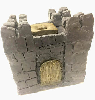
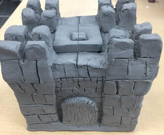
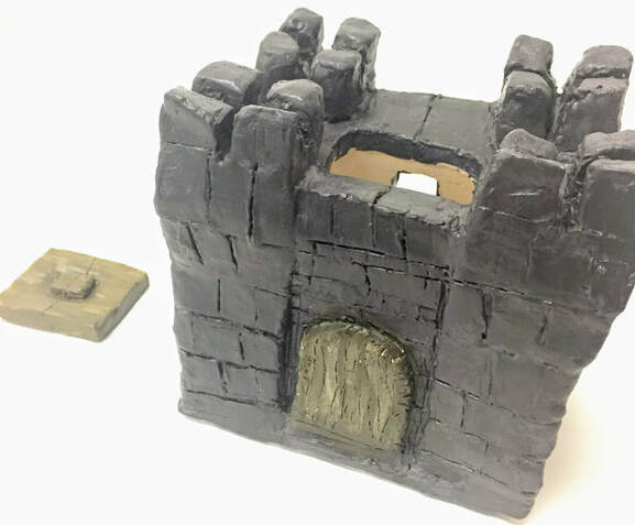 1. Since completing the in process blog post, my castle clay box has been fired in the kiln. I then painted it, starting with the gray color used for the castle walls and top, and moving on to painting with the various shades of browns on the castle door and lid. Afterwards I added a glaze coating to complete the piece.
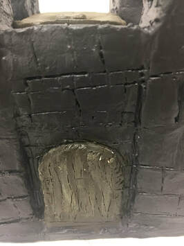
2. I find the texture successful on the finished piece, specifically the brick, or stone, texture on the walls of the box and the texture on the door that, combined with the various tones in the brown color, create a more realistic wooden texture like a real castle door would have. I also believe that the general castle shape is good and the small window in the back. 3. If I were to do this again, I would make sure to make it look neater and let the slabs dry enough so that they would be sturdier and not slightly lean in on the side. Another thing I would do to make it look neater is carve the lines that make the brick texture straighter and smooth everything out more before it dried.
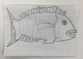
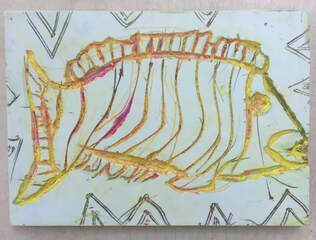
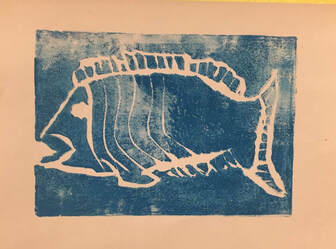 1. My piece shows off the theme of line as that is what the piece is entirely created of, especially as seen in the stripes on the side of the fish more towards its head. I also used the theme of line creating lines on the top and bottom of the fish that represent the fin-like features on this type of fish while incorporating the theme of line at the same time.
2. My piece was successful in the general use of lines and shape of the fish, as well as the ink that I used. I think that the ink was successful as I created the proper color and texture as I had planned for, where the blue color creates a water-like atmosphere while being more interesting as a background due to the white texture than a solid blue background would have looked. If I were to do this project again I would make sure to be more careful when cutting it out of the block so that I could create neater, crisper lines for the fish and stripes. I would also try to add more stripes into the piece to add more to the theme.
3. I found success in getting the overall shape of my piece. It is easy to tell from looking t it that it is a castle from the top, stone bricks, door. I find the door to be successful as well due to the wooden texture on it. The windows on the back of the piece is done well also.
4. My piece is currently greenware. To start making my piece I first drew and measured out the size and amount of clay pieces I would need. I cut and rolled a large slab of clay. Then I cut out my pieces from the large slab based off of my measurements. I scratched and slipped then joined all 6 sides, the door, and top of my piece together. Afterwards I added the stone texture to all sides and a wooden texture to the door. My clay box is now going to be fired and will become a bisque for me to paint and glaze. |